Nike Membership Rebrand
From Nike+ to Nike Membership: Repositioning a fading loyalty program into a membership service inviting all athletes to join the brand.
Role: Art Direction & Design Lead
Creative Direction: Aaron Belchere
Art Direction: Michael Hyp
Agency Partner: Gretel
THE BRIEF
The world of brand loyalty programs has been turned upside-down by a slew of new direct-to-consumer brands. Nike has over 170 million members. Many of them didn’t even know Nike Plus was a membership service—and an even smaller percent return to make purchases year on year.
As part of a holistic improvement to the system to sustain and grow its user base, Nike’s Membership team asked us to rethink, rename, and redesign Nike’s existing program, Nike+, into something instantly recognizable, inherently human, and efficient to execute across the brand’s global market.
THE SOLUTION
In a strong collaboration with NYC-based branding and strategy agency, Gretel, our cross-functional team simplified and strengthened the membership offering, ultimately bringing it closer to Nike’s core.
For years, Nike has served the community of athletes around the world. Bringing innovation, inspiration and motivation, we have encouraged the world to make sport a daily habit. We reimagined Nike Membership as a sport community where all athletes belong, and repositioned it as the primary point of entry into Nike’s digital service offerings.
MY ROLE
This project was a joint effort between Nike’s Membership, Digital, and Brand Creative teams. Our small Brand Creative team led the group on all things design and owned the agency relationship.
After leading the agency selection and review process, my primary responsibility was for all design evaluation and feedback throughout the process. Our internal teams worked to get executive approval and begin initial implementation. I oversaw the creation of the initial identity system and created foundational guidelines that were handed over to various internal teams to carry on and advance the work.

Branding
CALLING IT WHAT IT IS
From the initial kickoff meeting, the Nike Plus name was up for grabs. With the likes of Disney and Apple introducing new paid subscription services with the same moniker, the “+” had far more baggage than equity for Nike’s free membership offering.
Working with Gretel, we spent the first few weeks nailing down our tone, expression, and general strategy while also exploring a variety of names, and logos, that might fit. We continued to try on more names and logos as we pushed into design exploration, but every option just felt sticky—and not in a good way.
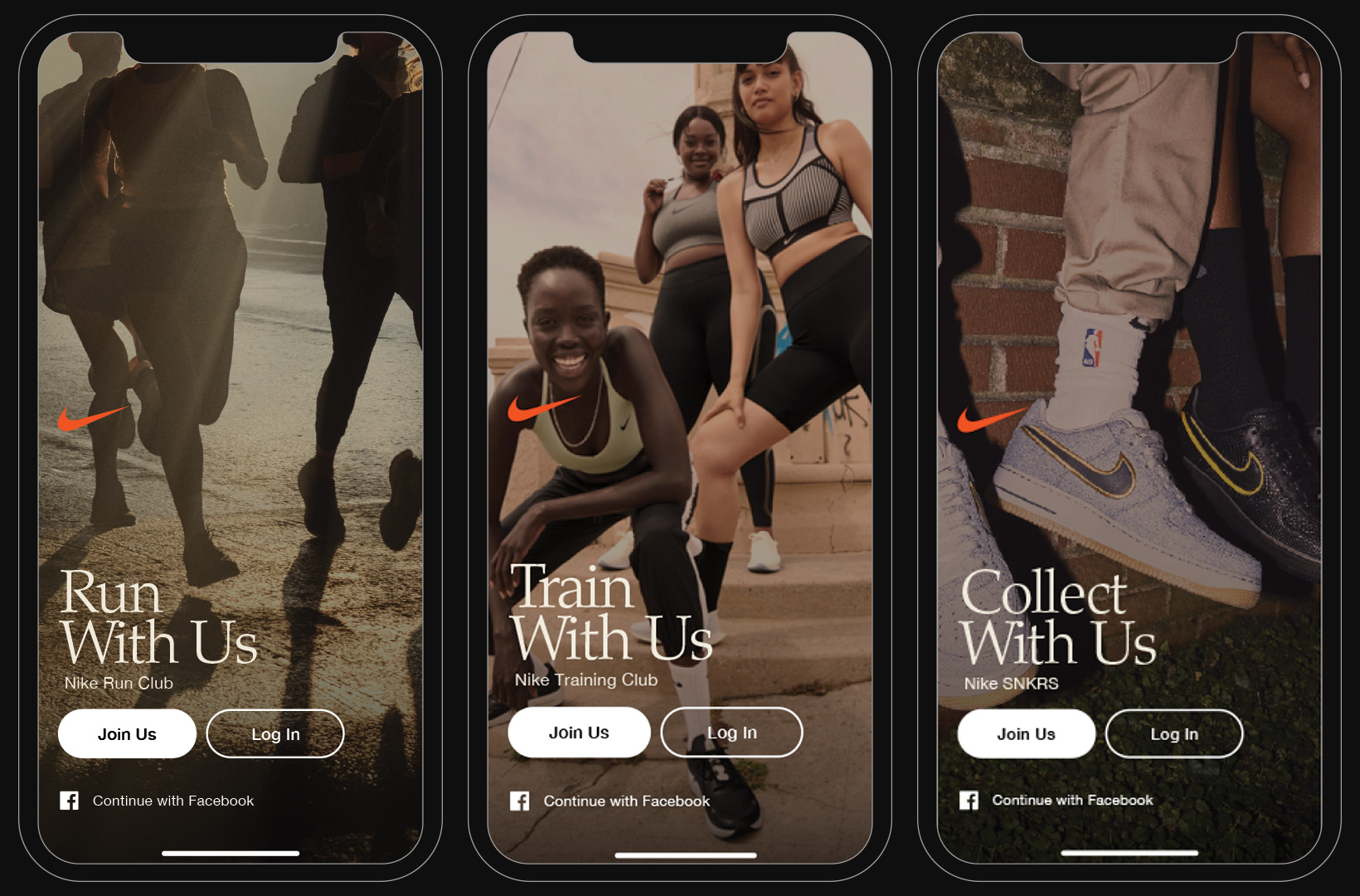
The answer was rather simple and right in front of us: “Nike Membership“. It was immediately transparent, understandable, and direct. We opted to forgo a logo or icon that needed to lock-up with the Swoosh, instead creating a simple wordmark to denote the service.
Ultimately, we saw this update as an embodiment of one of our key strategic shifts: Moving Nike from a brand with membership, to a membership brand.
From the initial kickoff meeting, the Nike Plus name was up for grabs. With the likes of Disney and Apple introducing new paid subscription services with the same moniker, the “+” had far more baggage than equity for Nike’s free membership offering.
Working with Gretel, we spent the first few weeks nailing down our tone, expression, and general strategy while also exploring a variety of names, and logos, that might fit. We continued to try on more names and logos as we pushed into design exploration, but every option just felt sticky—and not in a good way.
The answer was rather simple and right in front of us: “Nike Membership“. It was immediately transparent, understandable, and direct. We opted to forgo a logo or icon that needed to lock-up with the Swoosh, instead creating a simple wordmark to denote the service.
Ultimately, we saw this update as an embodiment of one of our key strategic shifts: Moving Nike from a brand with membership, to a membership brand.
BEFORE![]()
AFTER
![]()
AFTER
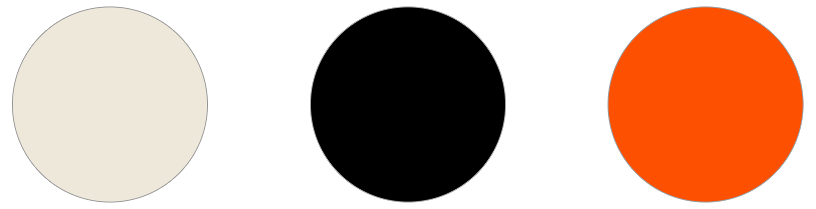
COLOR
Through its existence, Nike Plus had flings with both red and volt palettes. By the time this project started, Nike Plus had a long, twisted journey, and was essentially stripped of any brand elements beyond the name.
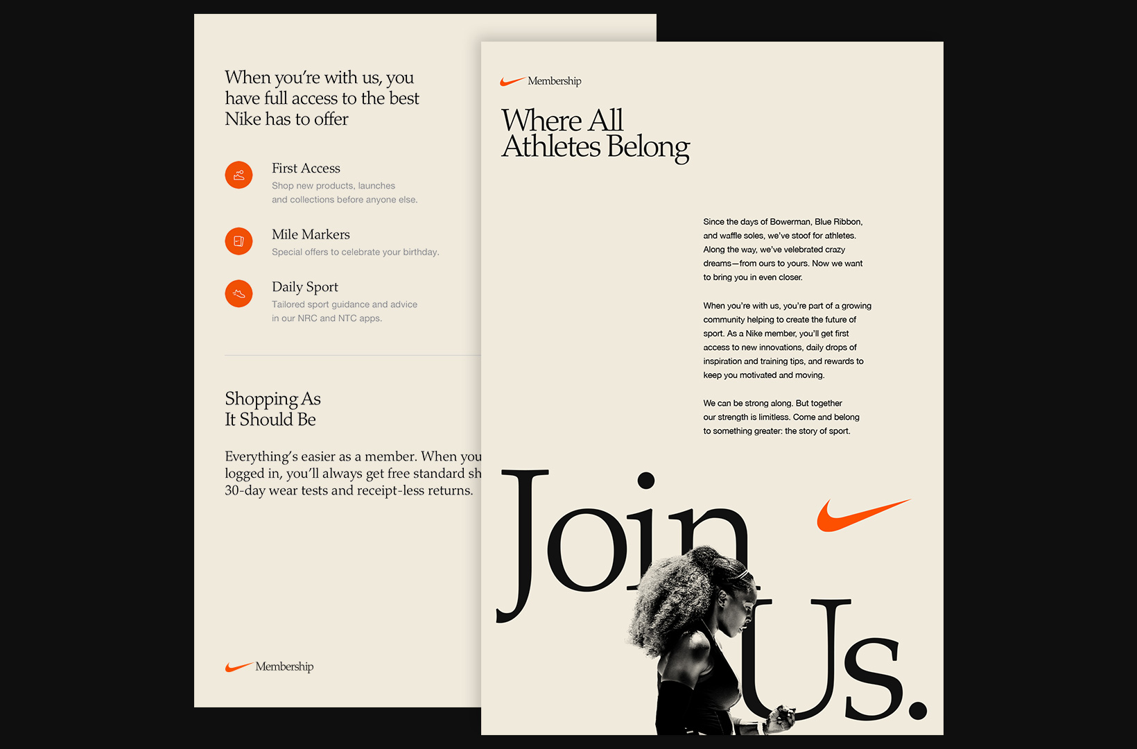
As we worked to reposition Nike Membership as one of the core expressions of the brand, we looked to Nike’s heritage to determine the color palette. The off-white gives a slight age while alluding to the slightly-yellowed paper that classic ads were printed on. Nike’s well-established orange became our accent, drawing the brand and the service closer together.
Through its existence, Nike Plus had flings with both red and volt palettes. By the time this project started, Nike Plus had a long, twisted journey, and was essentially stripped of any brand elements beyond the name.
As we worked to reposition Nike Membership as one of the core expressions of the brand, we looked to Nike’s heritage to determine the color palette. The off-white gives a slight age while alluding to the slightly-yellowed paper that classic ads were printed on. Nike’s well-established orange became our accent, drawing the brand and the service closer together.
Messaging
A SENSE OF BELONG
By the time this project started, any language originally associated with the Nike Plus brand had faded into the past and there were few existing examples of any coherent messaging strategy.
We knew the rebrand needed a simple yet strong strategic foundation upon which messaging and design could build. We imagined Nike Membership as a place of belonging for all athletes across the world. This hefty and democratic goal led to a tone that felt conversation, human, real, and inviting.
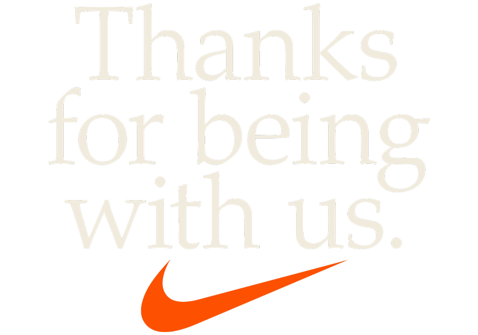
There are three core expressions at the heart of the messaging matrix that are meant to serve as an invitation, declaration, and sign off. We also worked on initial guidance for all messaging across various media, from the quick elevator pitch to the full blown benefit proposition, and how those should flex for logged in vs logged out, online vs in store.
By the time this project started, any language originally associated with the Nike Plus brand had faded into the past and there were few existing examples of any coherent messaging strategy.
We knew the rebrand needed a simple yet strong strategic foundation upon which messaging and design could build. We imagined Nike Membership as a place of belonging for all athletes across the world. This hefty and democratic goal led to a tone that felt conversation, human, real, and inviting.
There are three core expressions at the heart of the messaging matrix that are meant to serve as an invitation, declaration, and sign off. We also worked on initial guidance for all messaging across various media, from the quick elevator pitch to the full blown benefit proposition, and how those should flex for logged in vs logged out, online vs in store.
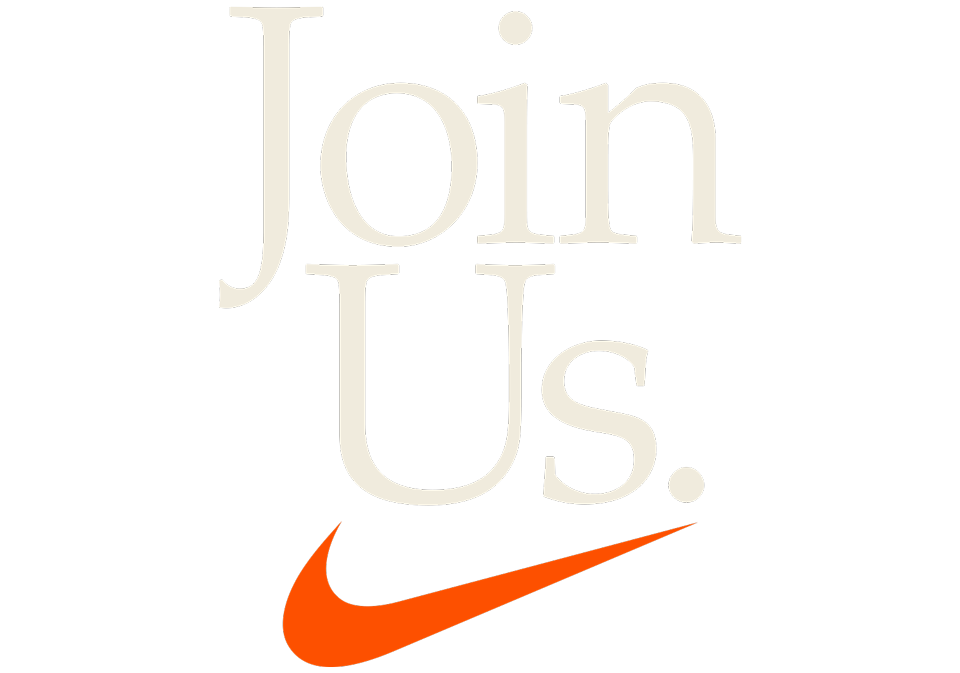
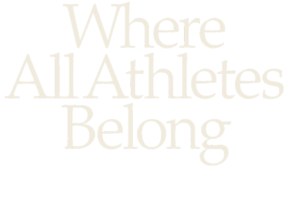
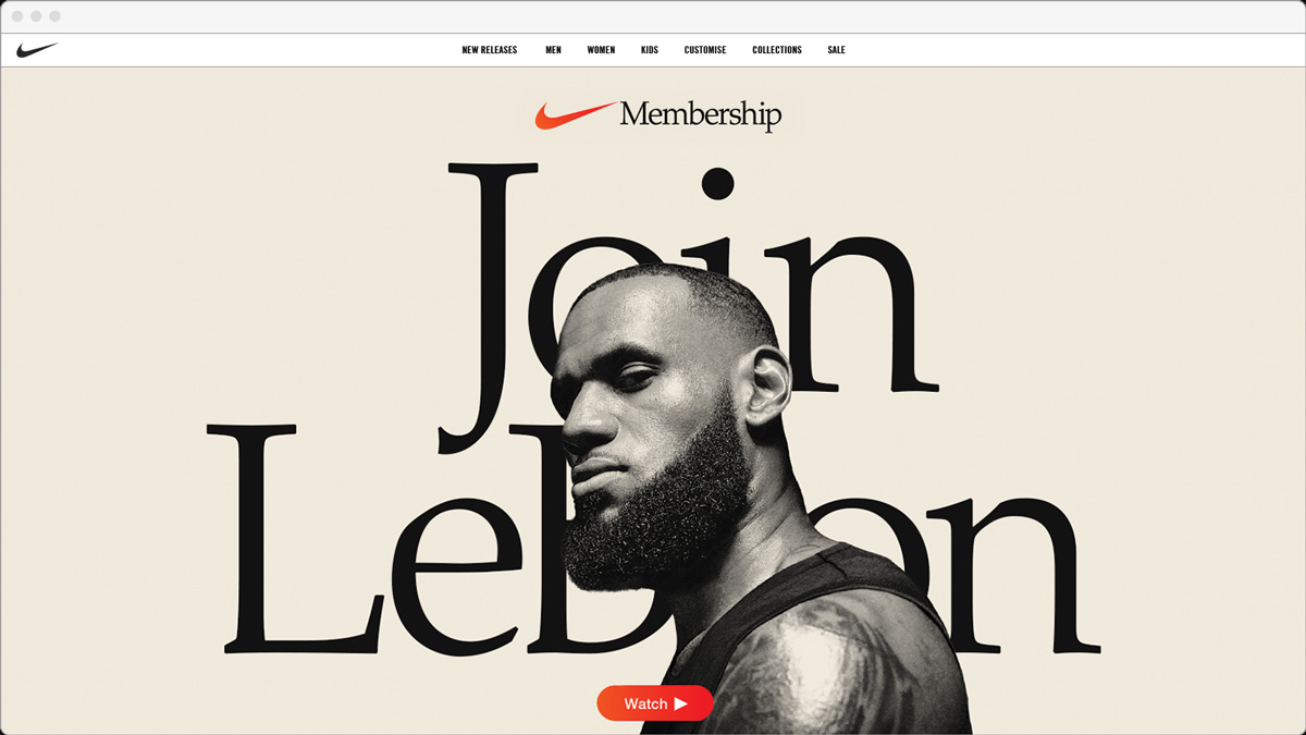
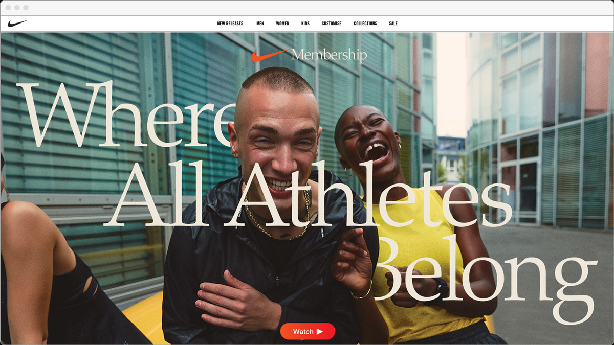
INVITATION AND DECLARATION
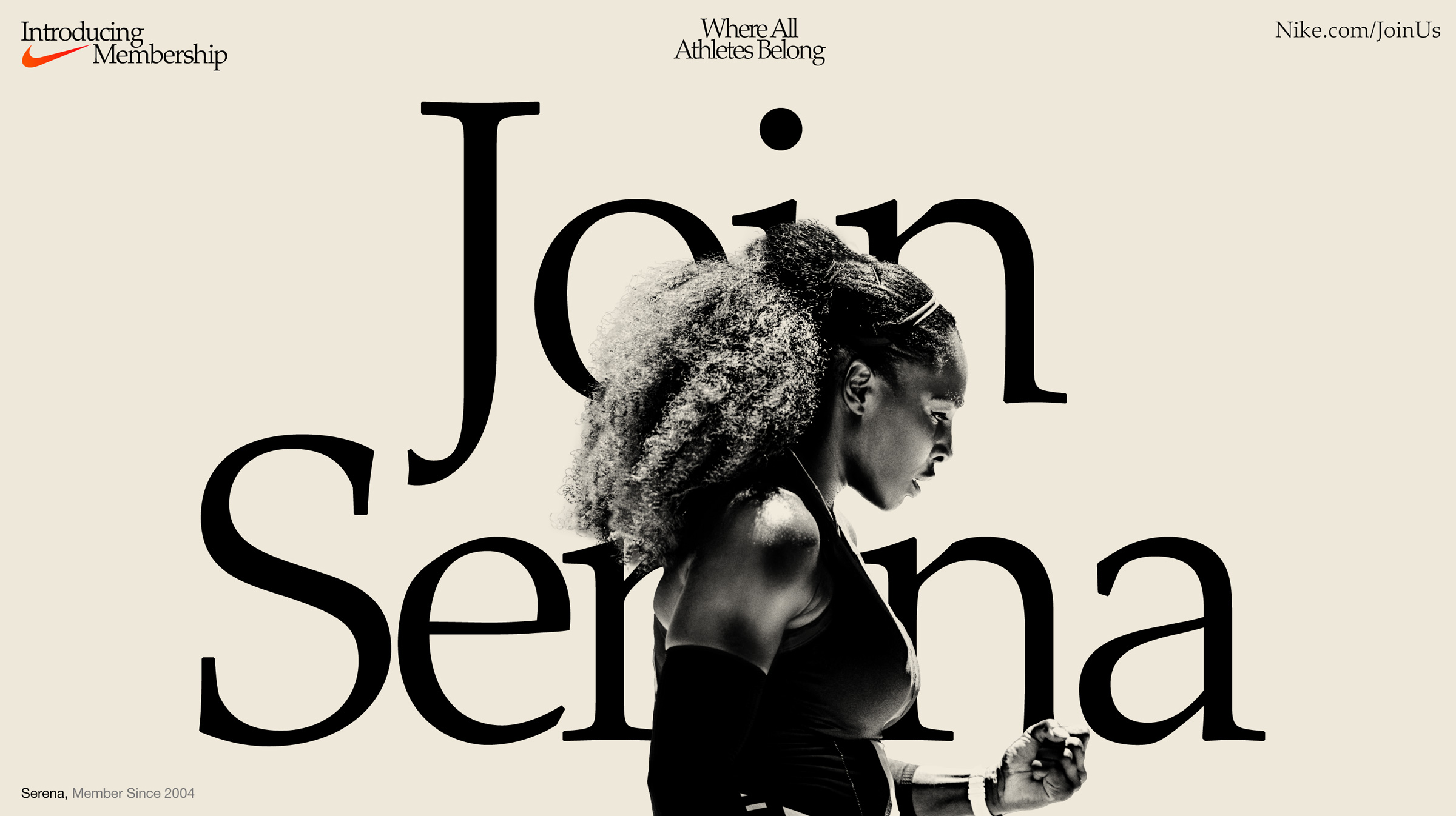
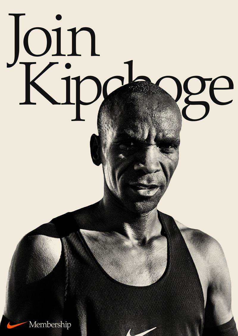
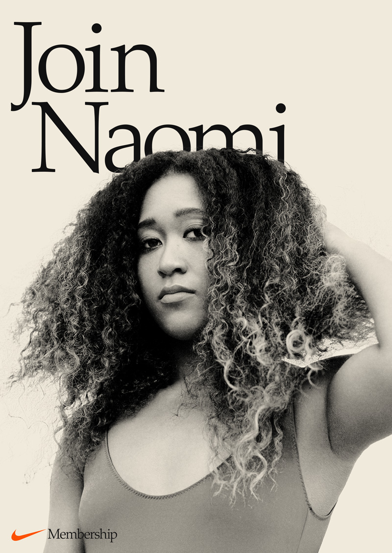
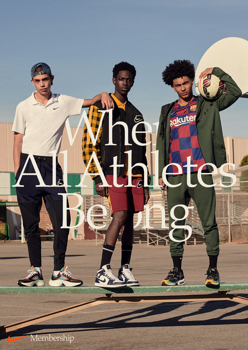
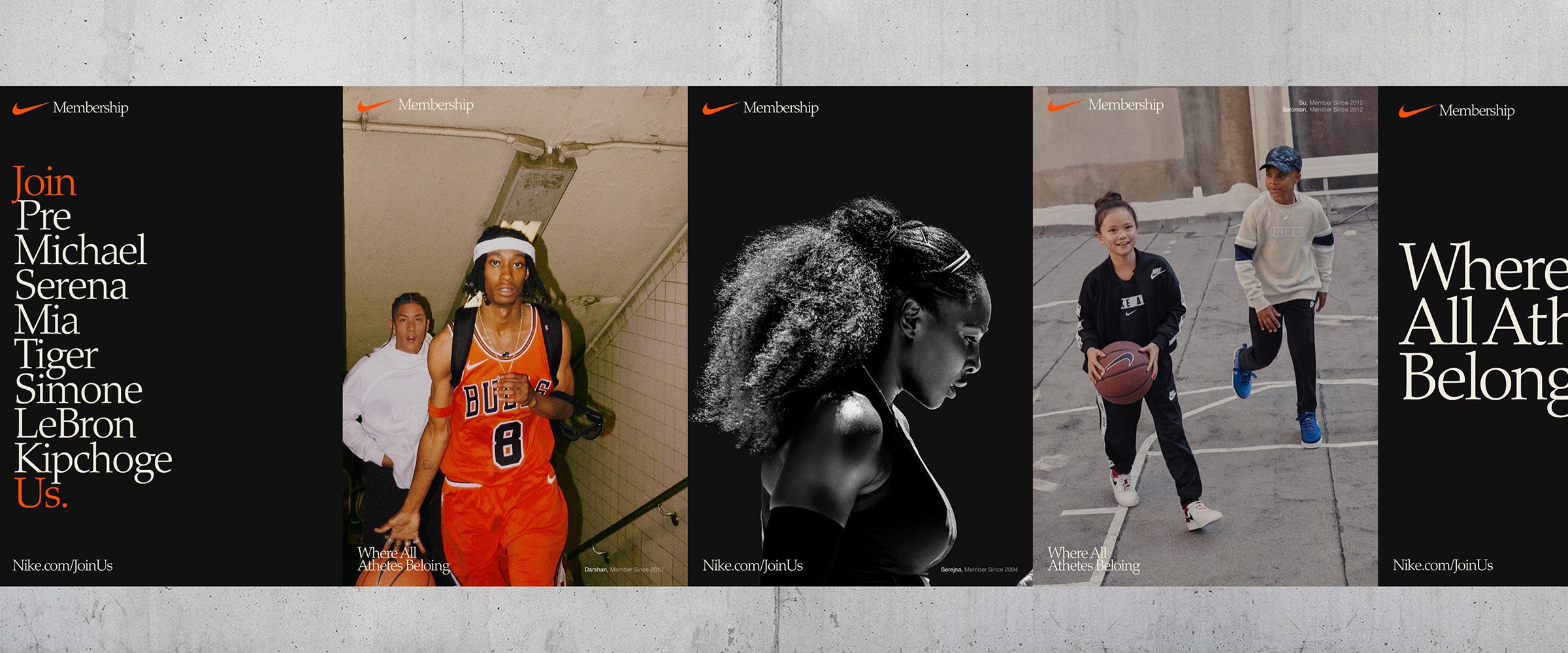
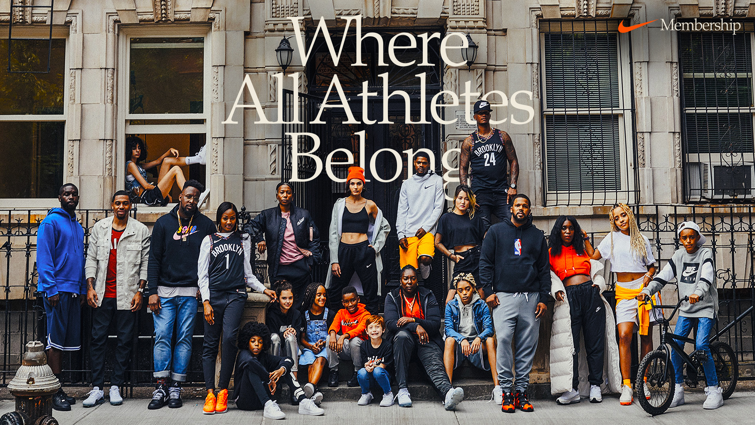
We created a simple system when pairing our key declarations with imagery. As an extension of the invitation, we paired a modified “Join Us” with some of our most celebrated pro athletes, humanizing the brand while celebrating the athlete and creating aspiration in the viewer. Our declaration, “Where all athletes belong,” is always paired with colorful everyday athlete imagery to create a sense of connection and reinforces the idea that everyone can be a member of Nike.
We created a simple system when pairing our key declarations with imagery. As an extension of the invitation, we paired a modified “Join Us” with some of our most celebrated pro athletes, humanizing the brand while celebrating the athlete and creating aspiration in the viewer. Our declaration, “Where all athletes belong,” is always paired with colorful everyday athlete imagery to create a sense of connection and reinforces the idea that everyone can be a member of Nike.
© 2021 BM