Nike Move To Zero
Revealed in 2019, Move to Zero is Nike’s journey toward zero carbon and zero waste, with a singular aim: help protect the future of sport. Working closely with various Sustainability functions at Nike, our team lead strategy and branding for the initiative.
Role: Art Direction & Design Lead
Creative Direction: Aaron Belchere
Art Direction: Danny Demmers
Design: Nemanja Jehlicka
Agency Support: Accept & Proceed

BRIEF
Climate change is threatening the future of sport, and the world. 94% of GenZ believe companies should be environmentally friendly, and consumers are demanding companies be useful or get out of the way.
Nike has a number of separate teams working on sustainable products and innovations at all times, but historically, there was no central hub nor focus. Move to Zero (MTZ) was created to package those efforts together under a central focus and single brand.
SOLUTION
Move to Zero is a look at the company’s past to inspire the future. With the young consumer in mind, we developed the concept of “Optimistic Urgency” to inform the work.
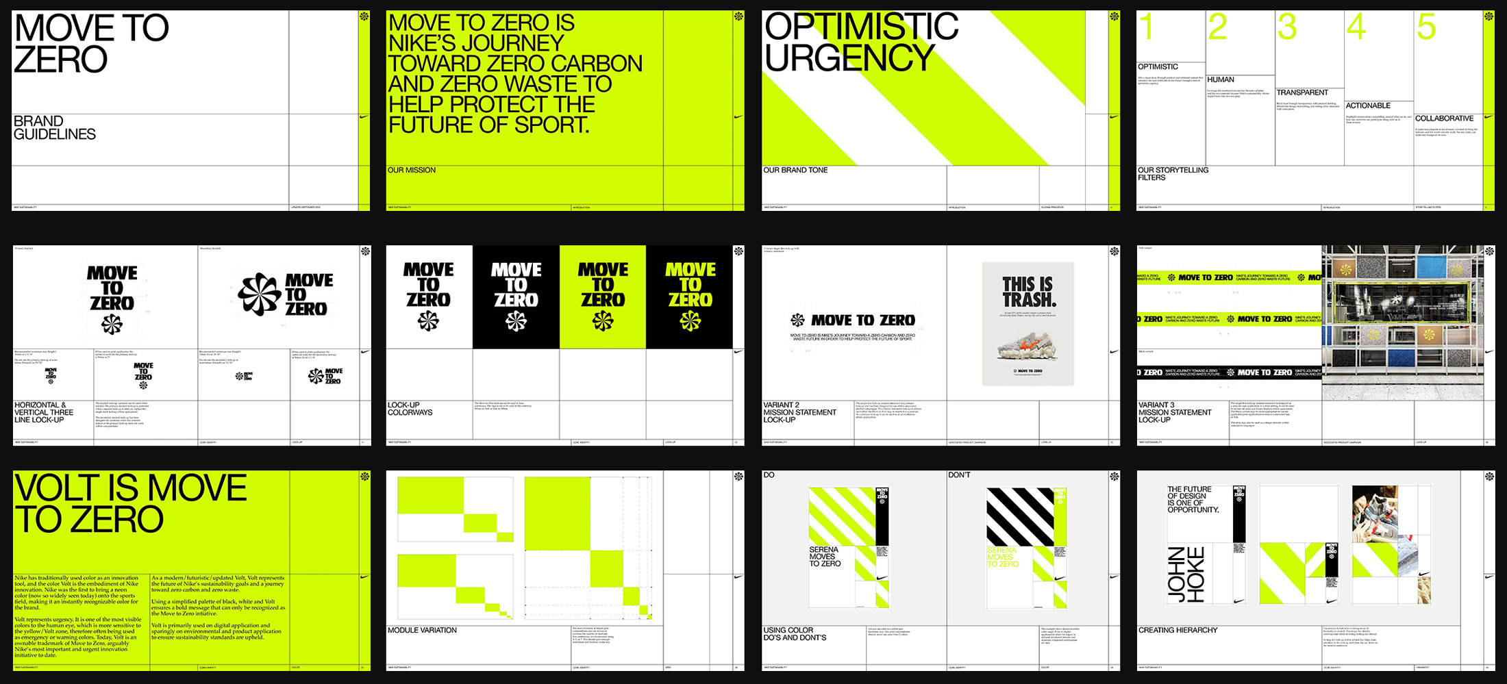
We developed an identity system that felt fresh and new, but also informative and trustful. An exposed grid speaks to the transparency of the structure, hazard striping mimics emergency vehicles, and Volt keeps it undeniably Nike.
MY ROLE
Our small team was brought into the process early on, working with cross-functional teams from start to finish on strategy, naming, and design. After working closely with Aaron and Danny on initial strategy and direction, I led art direction and design with Aaron’s creative oversight.
Our primary deliverable was an identity system and design guidelines that could be handed over to other design teams for project-specific execution. I was also responsible for engaging and leading agency relationships as we worked to expand and systemize the work and guidelines.

Identity
A SIMPLE KIT OF PARTS
We developed an identity system that felt fresh and new, but also informative and trustful. An exposed grid speaks to the transparency of the structure, hazard striping mimics emergency vehicles, and Volt keeps it undeniably Nike.
LOCK-UP
![]()

MISSION STATEMENT
![]()

EXPOSED GRID & HAZARD STRIPING
![]()

COLOR
![]()
Reduce, Reuse, Recycle
[The Logo]
THE SUNBURST
You might already recognize the icon without knowing what Move to Zero is. That’s because the mark was one of the first iterations of the Nike Swoosh to appear on product.
The Sunburst was initially sketched out in the mid 70s by Nike’s first employee, Jeff Johnson, because he felt like the asymmetry of the Swoosh didn’t work well on product. Geoff Hollister refined the mark, and Carolyn Davidson (designer of the Swoosh) went on to use it on product.
As we began research and design exploration for Move to Zero, the Sunburst became more and more intriguing. We were talking a lot about circularity and thought, what if we embodied the concept of circular design, and reclaimed this logo as a marker for all things sustainable?
After conversations with the apparel teams, who were still using the mark as a hertiege decorative element, and with the blessing from Jeff Johnson himself, the Sunburst was declared the offical mark of MTZ.
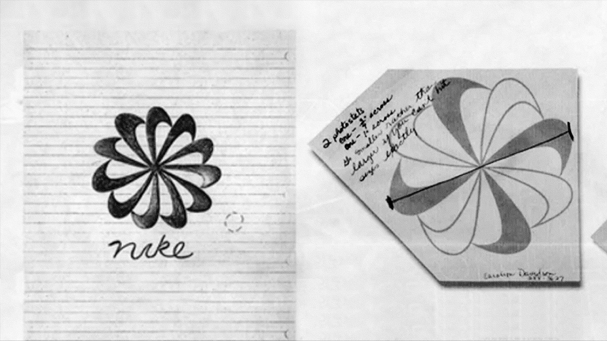 Jeff’s original Sunburst sketch (left) and Carolyn’s drawing with application notes (right)
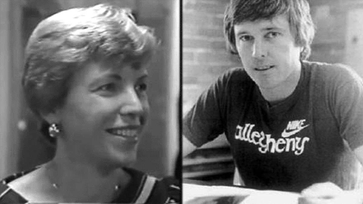 Carolyn Davidson & Jeff Johnson
THE WORD MARK
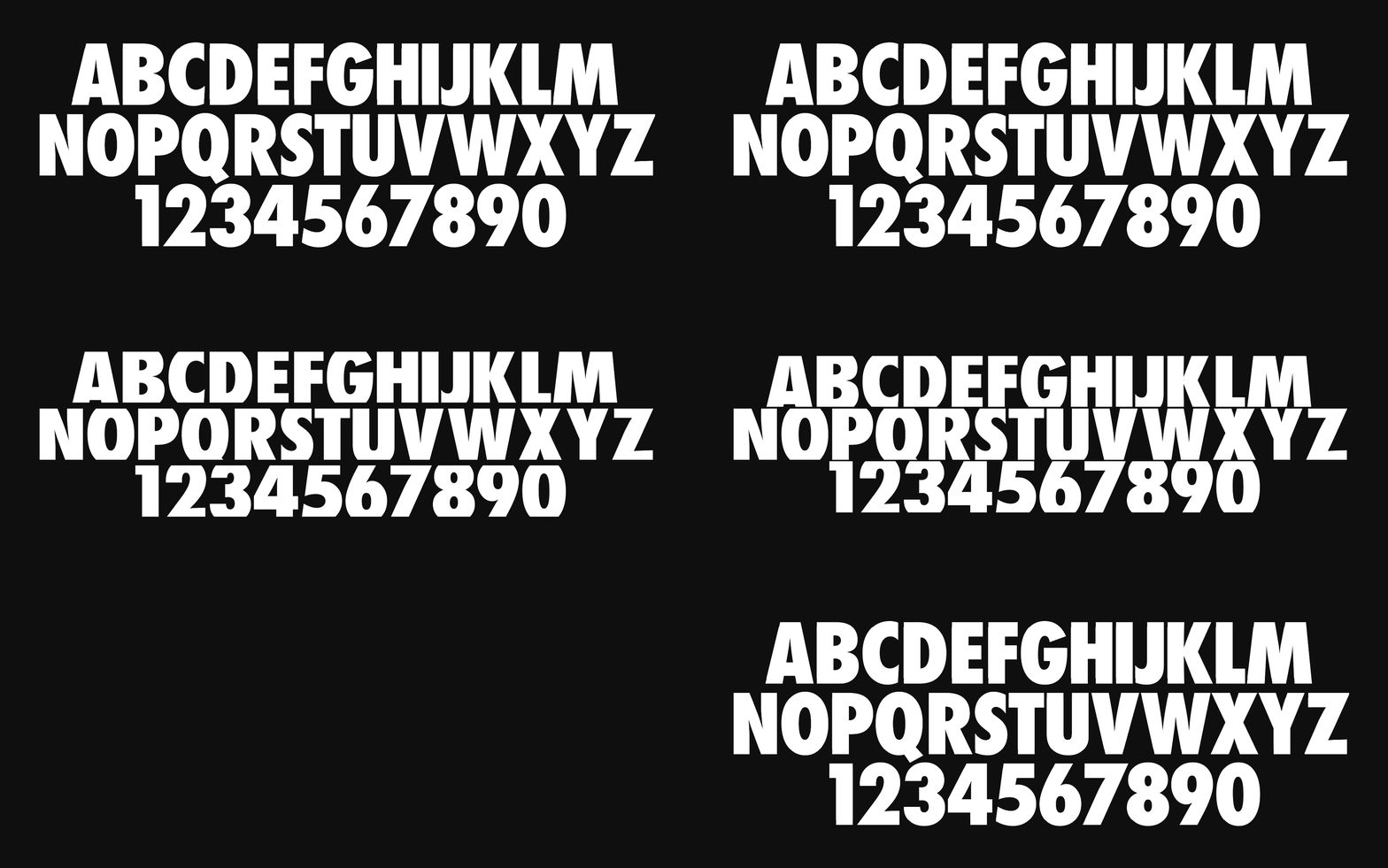
Knowing MTZ was positioned to become a core pillar of the company, we didn’t want to stray too far from the brand’s core typeface, Futura Condensed Extra Bold.
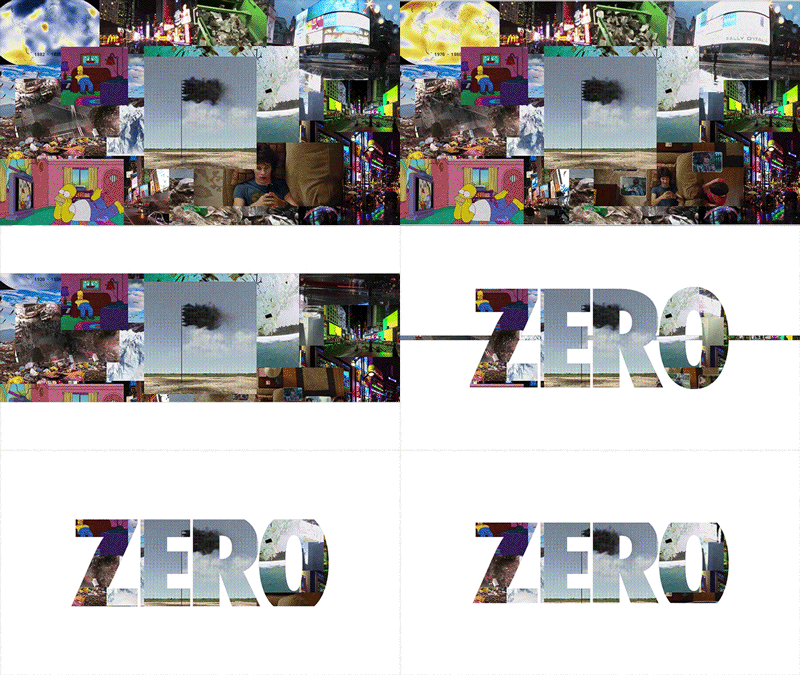
The typography for the wordmark comes with a slight nod to the idea of reduction and visually “moving to zero”. We chopped off the top and bottom of the letterforms, creating a truncated face that is 80% of the original height.
This decision on this coinceded with a presentation page (top right) positioning MTZ as the brand’s answer to the abundance of excess in the world.

Circular Design Guide
GUIDING THE FUTURE OF THE IDENTITY
As we were in the midst of still figuring out and nailing down the Move to Zero identity, our team was involved with designing of a publication and website between Nike and Central St. Martins that coincided with Helsinki Design Week in 2019.
My teammate, Nemanja Jehlicka, led the design for the project with Portland-based agency, This Design.
Early elements of the branding: the exposed grid, utilitarian type, and the Sunburst; are present and served as inspiration to the final identity system.
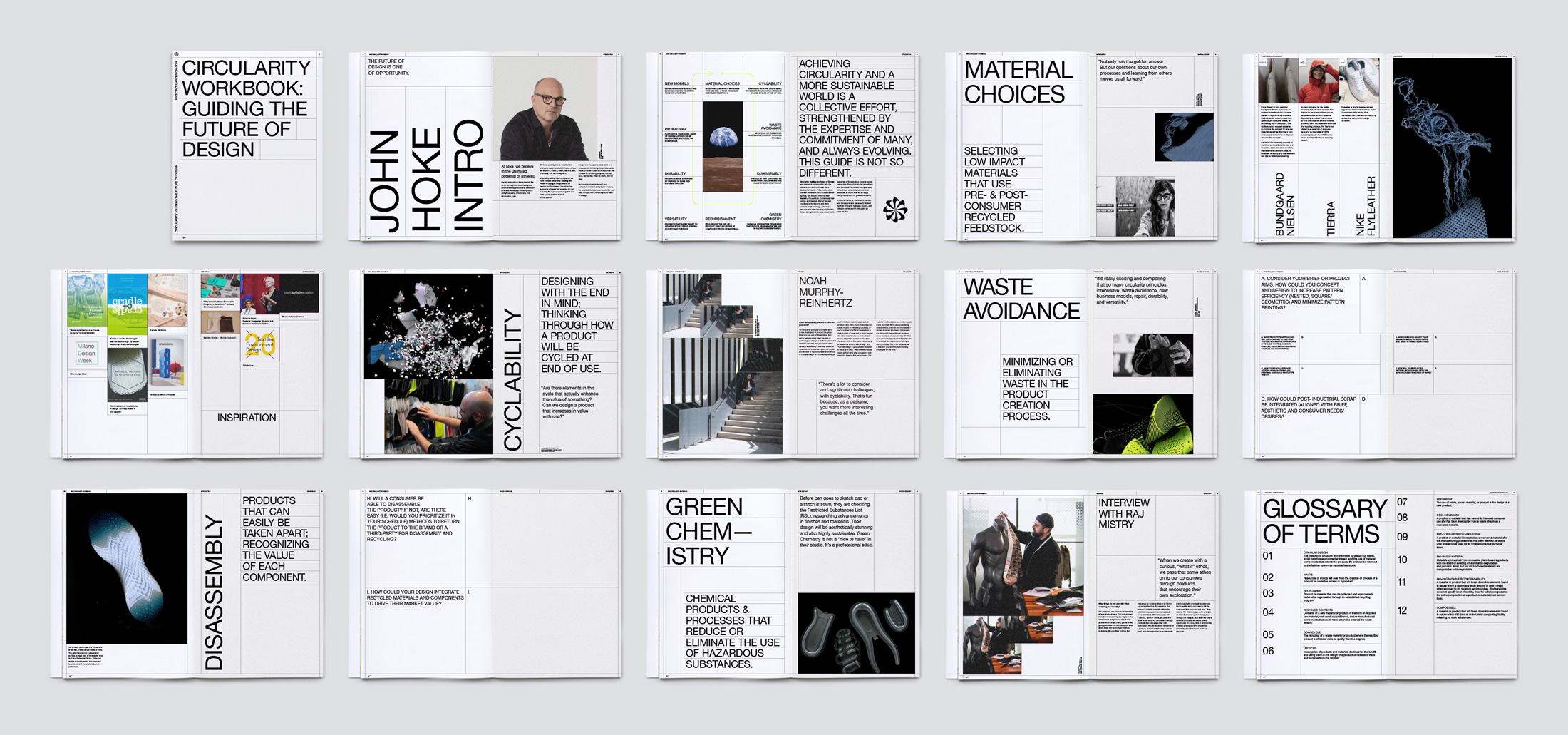 Design by Nemanja Jehlicka in collaboration with This Design
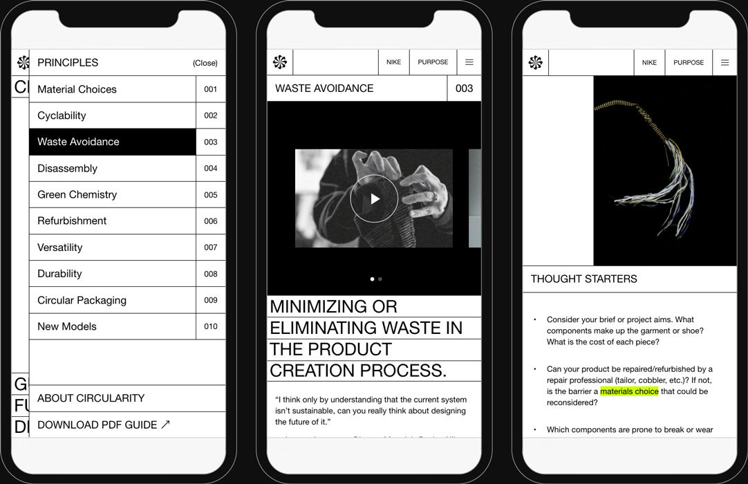
TAKE IT ONLINE
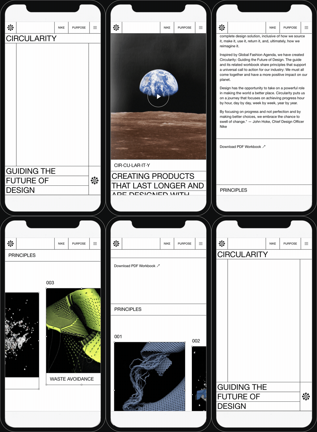
The team did a great job at translating the printed guidebook into a digital space. The responsive design proved favorable to the exposed grid and use of whitespace.
Visit the Nike Circular Design Guide site.
The team did a great job at translating the printed guidebook into a digital space. The responsive design proved favorable to the exposed grid and use of whitespace.
Visit the Nike Circular Design Guide site.
Packaging
& Product
BRINGING IT TO LIFE
The MTZ branding is slowly making its way onto apparel and footwear packaging.
Working with the Sustainable Product and Packaging teams, I designed packaging direction for the global shoebox and hangtags. This was a delicate dance between what we wanted to do and what we could do logisticaly and legally.
As more MTZ projects pop up, like Nike France’s expansion of the Reuse-A-Shoe program, Geo and City Studios have begun continued to implement the branding for a unified experience.
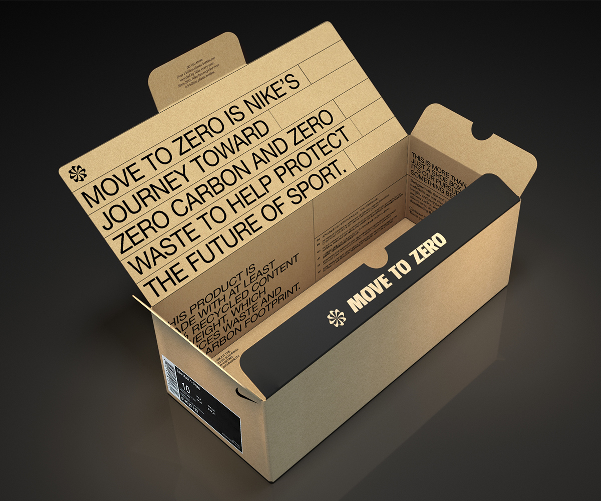 Shoebox concept design
 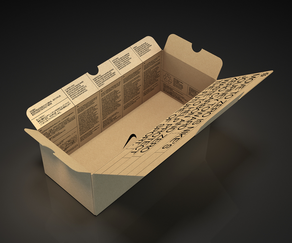 Messaging is translated to 7 key languages so the design can be used globally
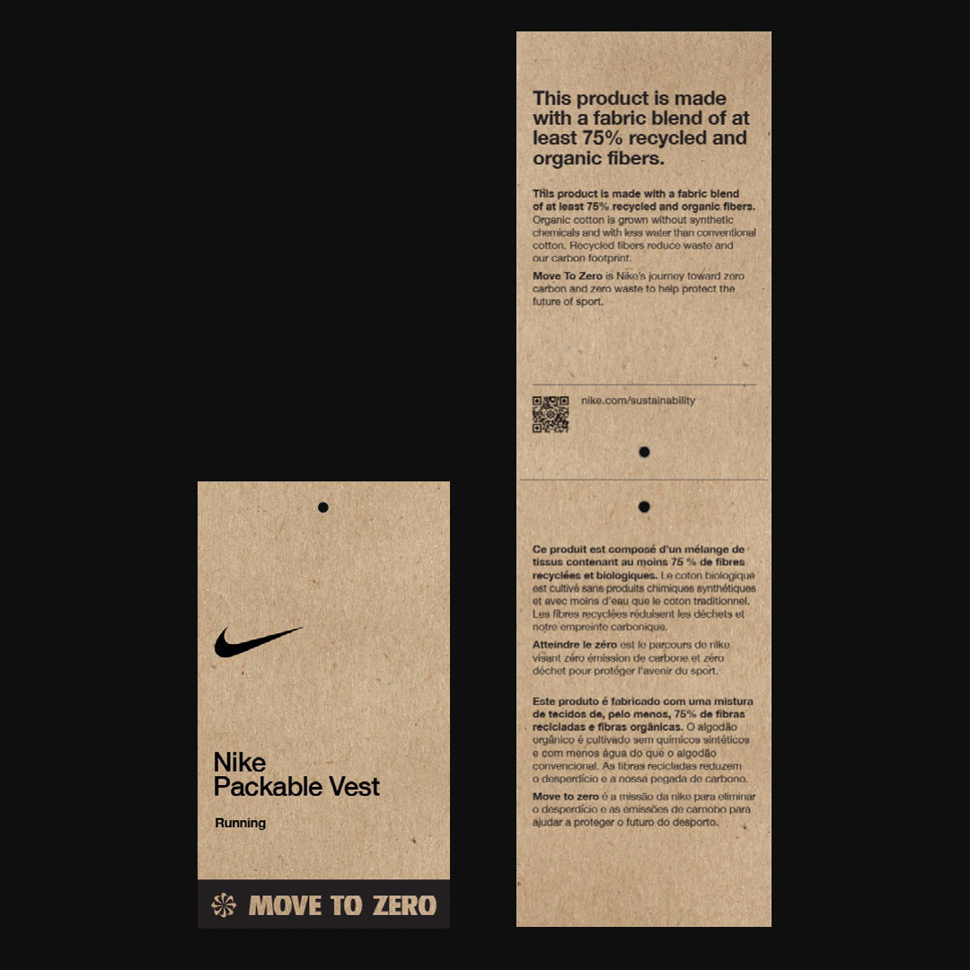 Final hangtag design by Nike Packaging Studio
 Reuse-A-Shoe Bag rendered by Area of Work for Nike Paris Studio
 Final box lineart by Nike Packaging Studio
ON PRODUCT
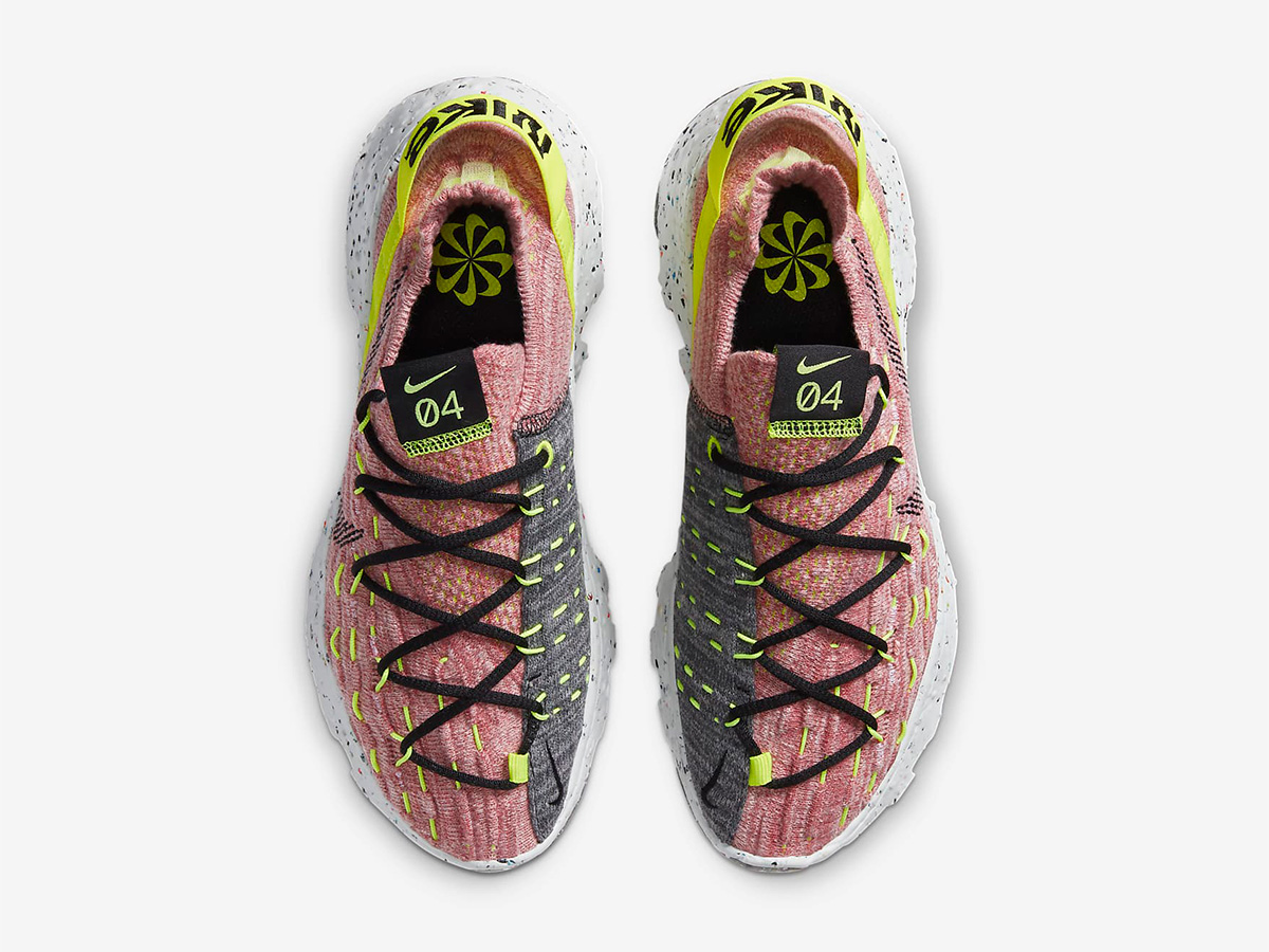
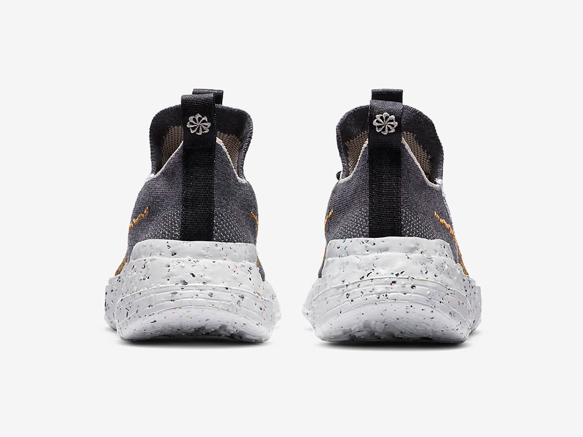
The Sunburst has shown up as a heritage graphic on a variety of products since the 2000s.
Today, the Sunburst is no longer a part of the brand’s heritage, but a mark of its future.
The use of the Sunburst has been limited to branding products which reduce carbon and/or waste in a significant, measurable way, under guidelines set by Move to Zero.
Digital
SUSTAINABLE NAVIGATION
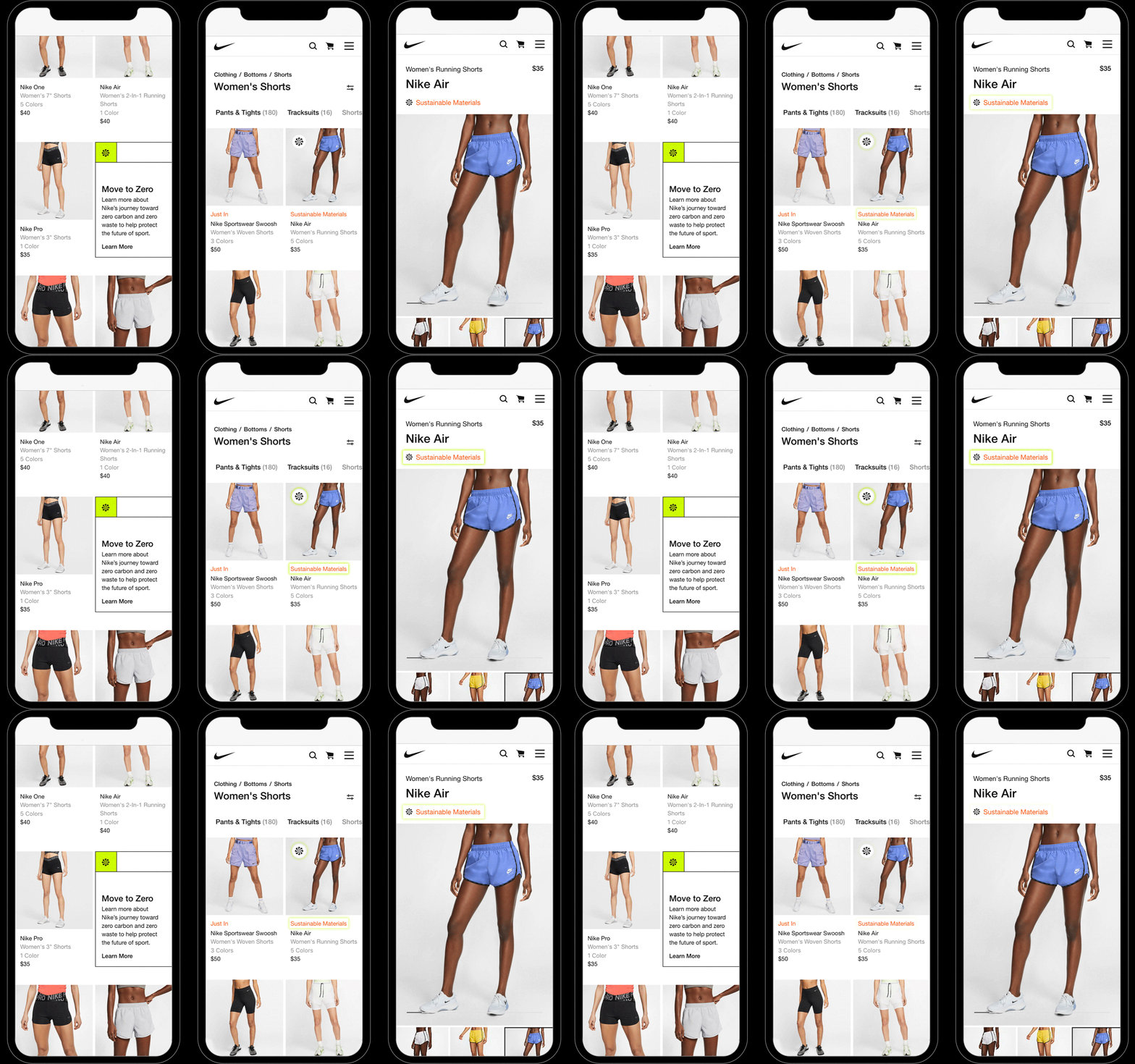
In addition to MTZ seasonal creative, the Sunburst has found a home on Nike.com.
On Earth Day 2020, the site introduced features to make it easier to search, shop and learn about sustainable products, using the icon as a product badge for instant differentiation when shopping online.
Read more about it here.
Retail
IN THE WILD
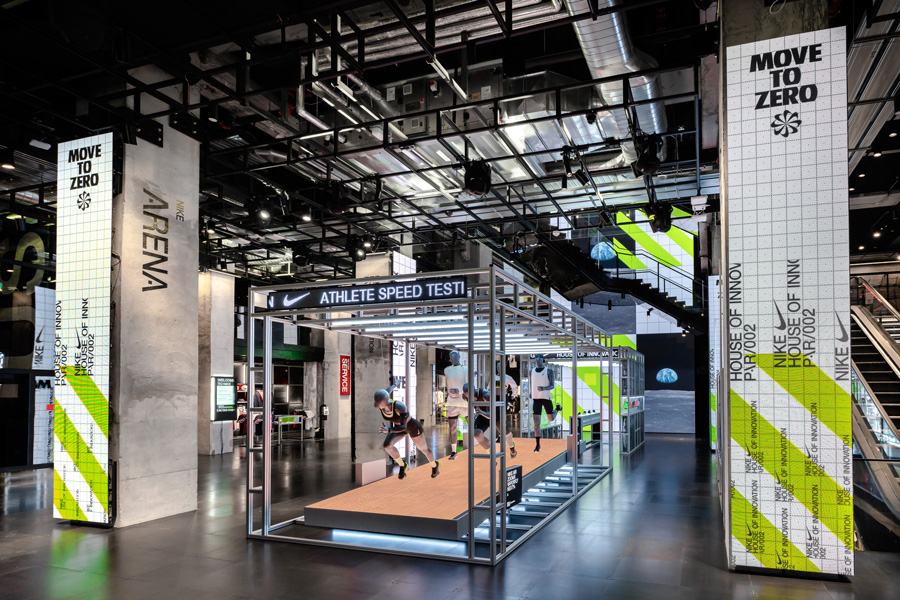
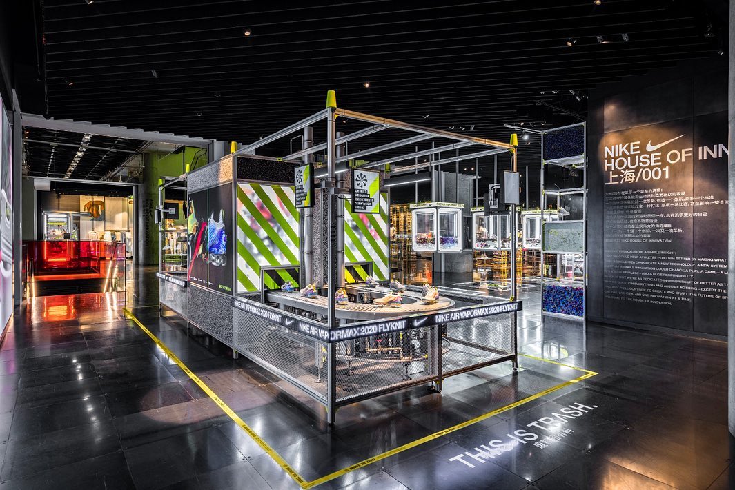
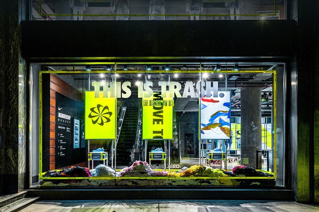
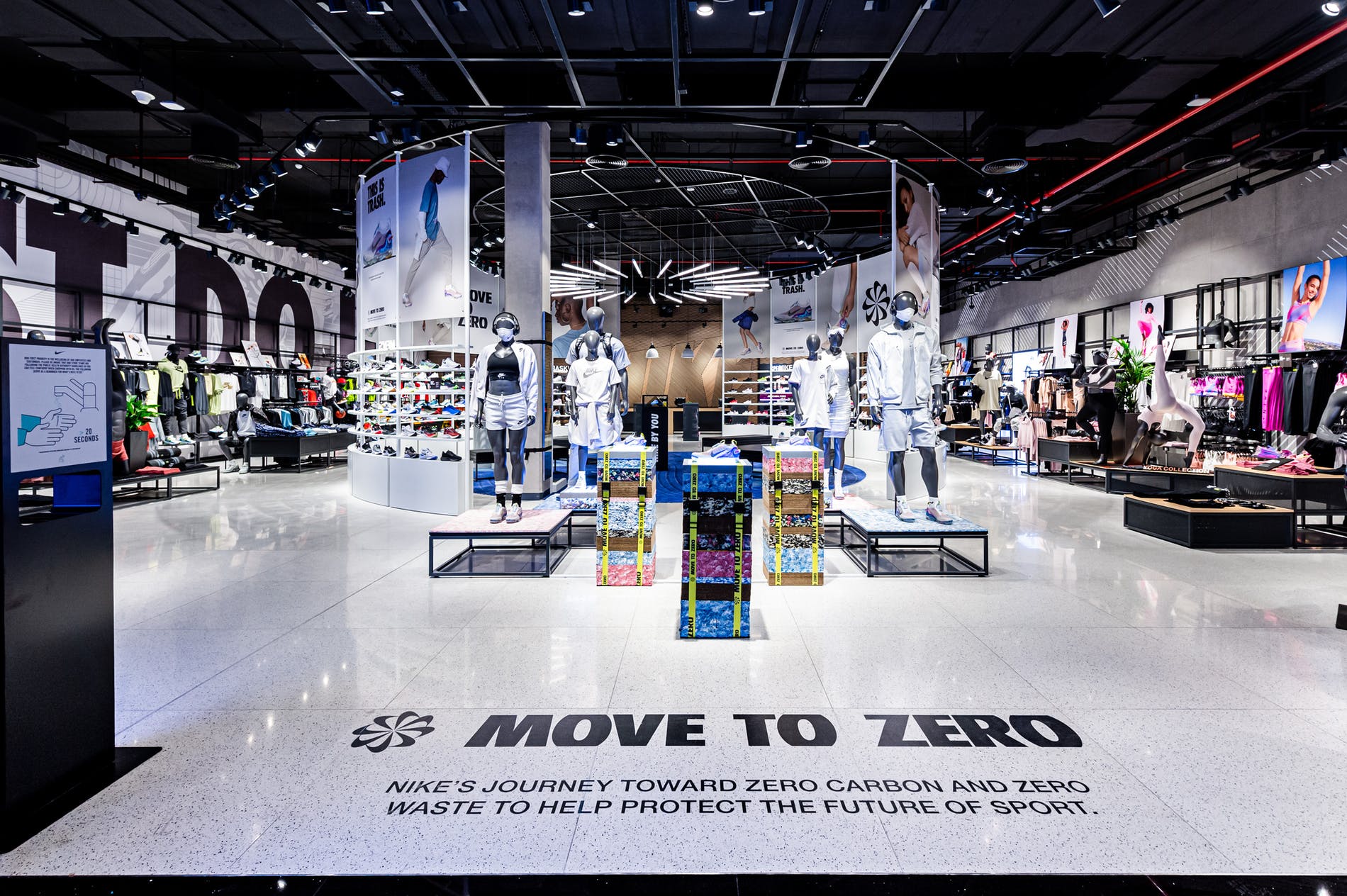
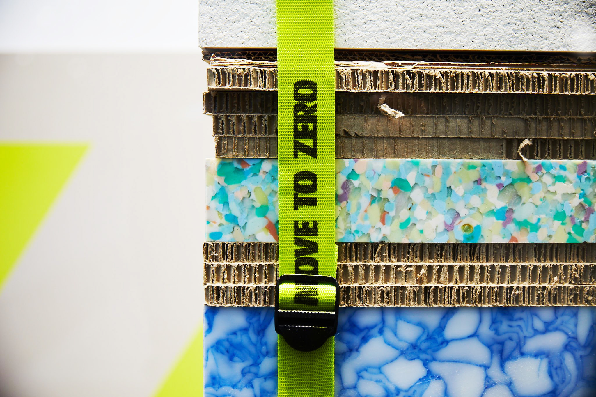
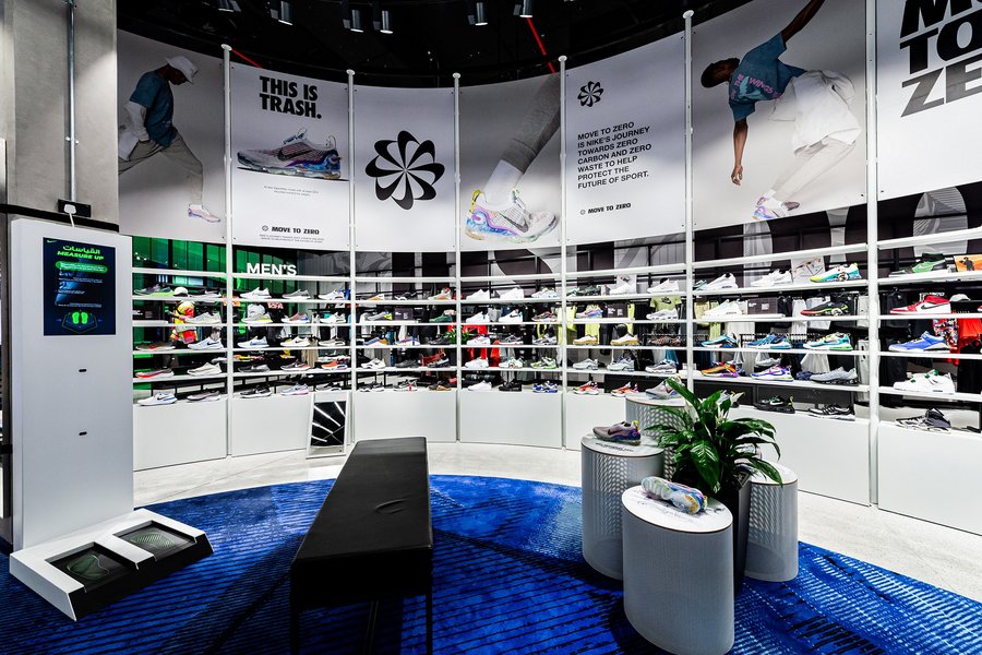
The MTZ branding has been implemented by the Retail, Category, and Geo teams in store locations worldwide to create, promote, educate, and designate sustainable product areas.
The MTZ branding has been implemented by the Retail, Category, and Geo teams in store locations worldwide to create, promote, educate, and designate sustainable product areas.

Extensions
PASSING THE BATON
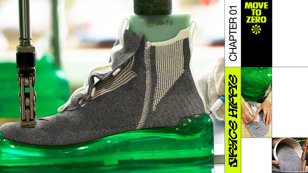
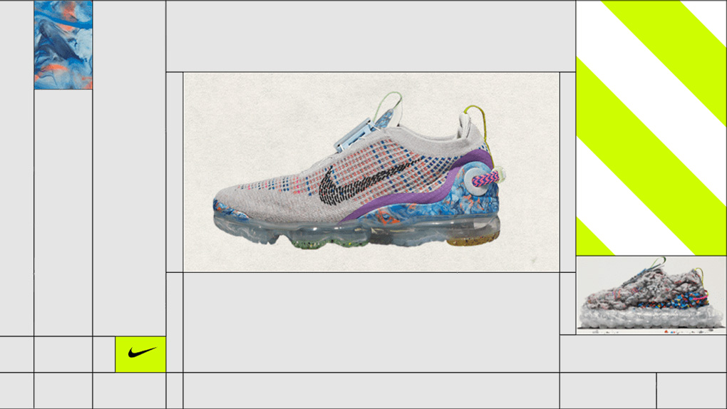
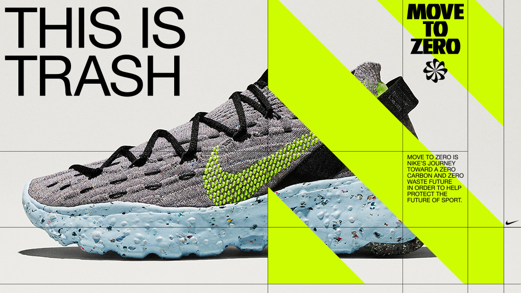
The MTZ identity is making its way into the world as a vessel to hold various sustainable product campaigns. It allows teams the flexibility to chose how heavy handed the the branding needs to be, from just a logo application, to full use of the grid.
A notiable example of the system in use the is Space Hippie Behind the Design series in collbaoration with Godfrey Dadich Partners.
Check out the series on Youtube.
Space Hippie Trailer by Godfrey Dadich Partners
© 2021 BM