Nike Air
Rebranding one of Nike’s biggest footwear innovation platforms to realign consumer expectation and build brand equity.
Role: Art Direction & Design Lead
Creative Direction: Aaron Belchere
Art Direction: Danny Demmers
Type Design: Nemanja Jehlicka
Agency Support: Accept & Proceed
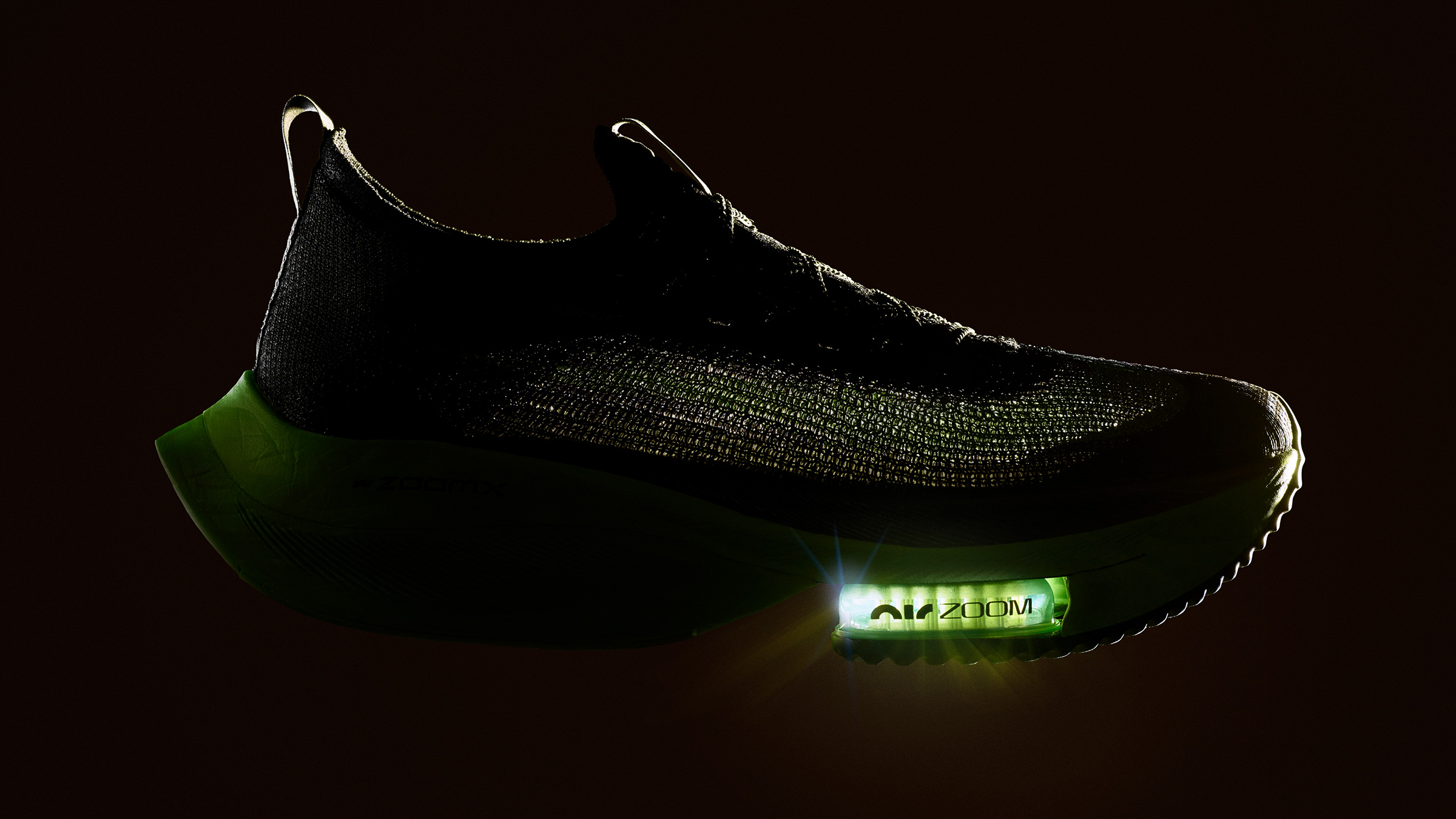
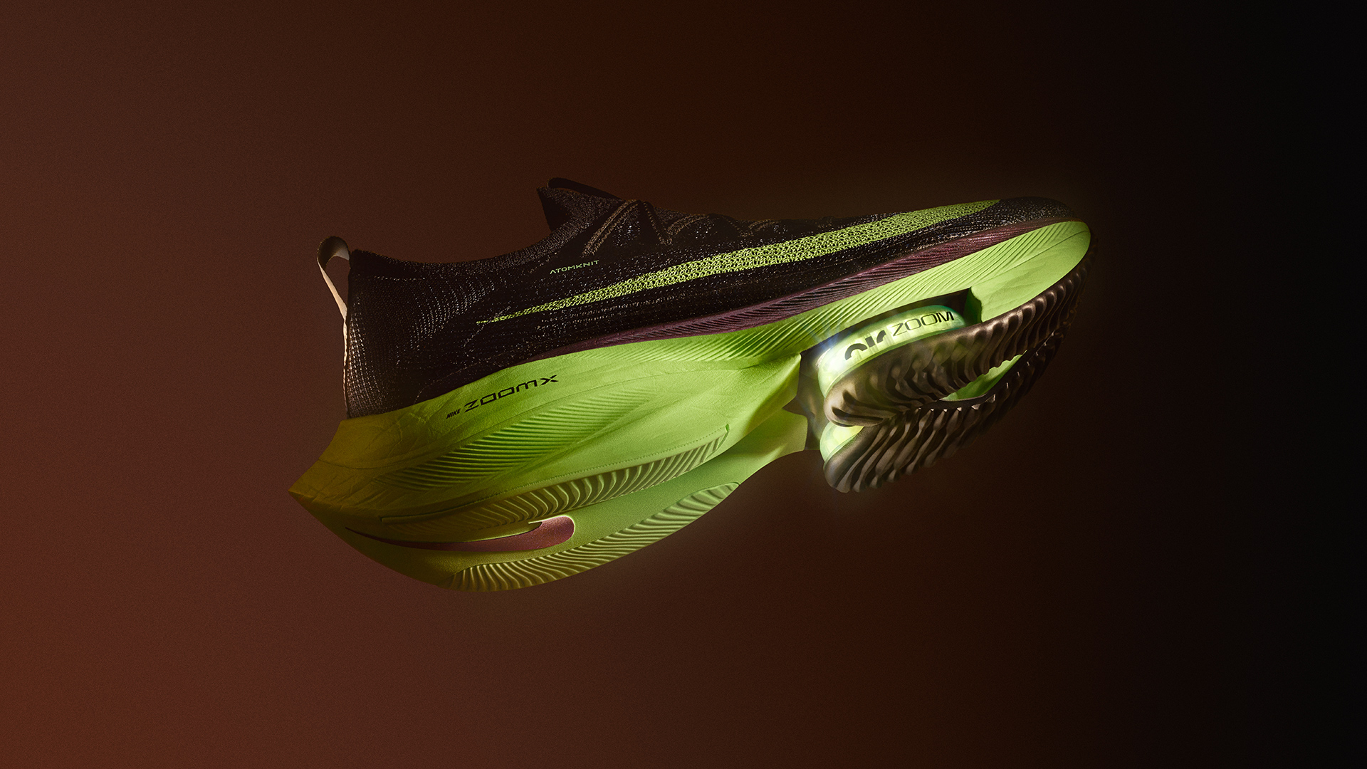
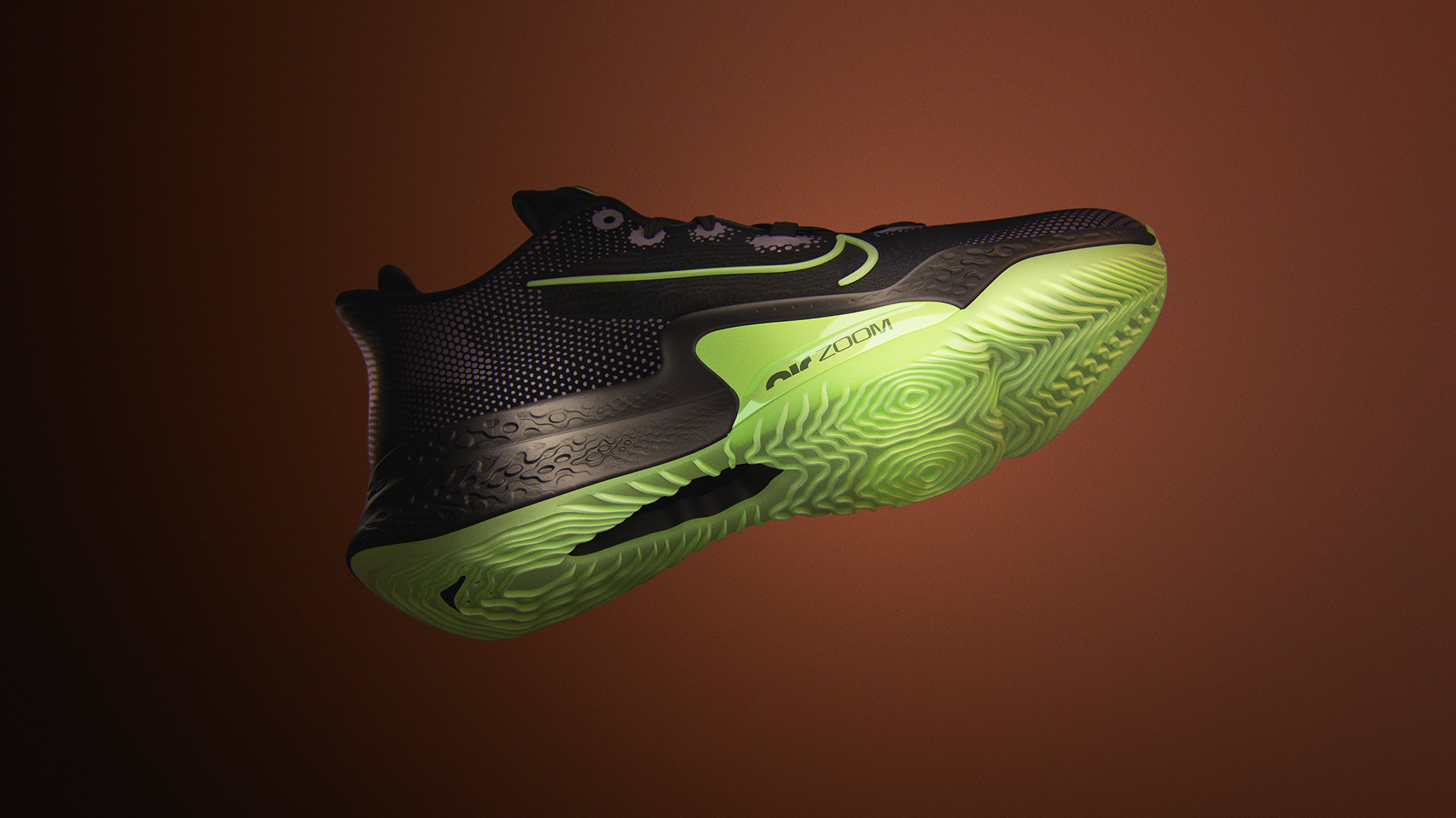
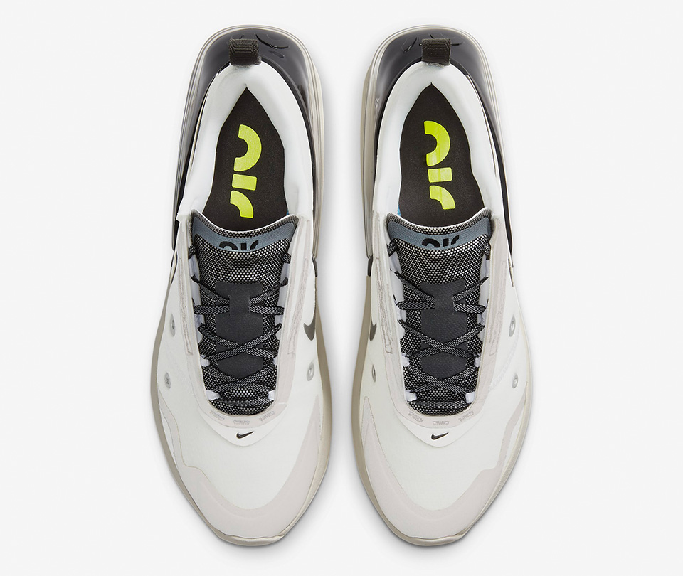
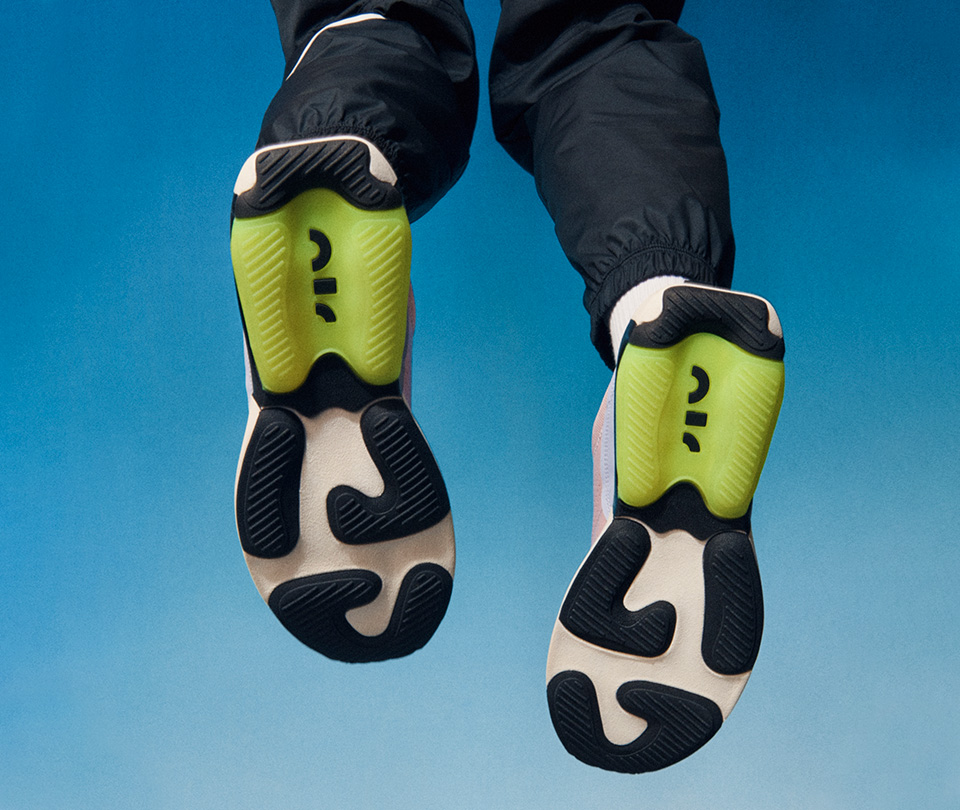
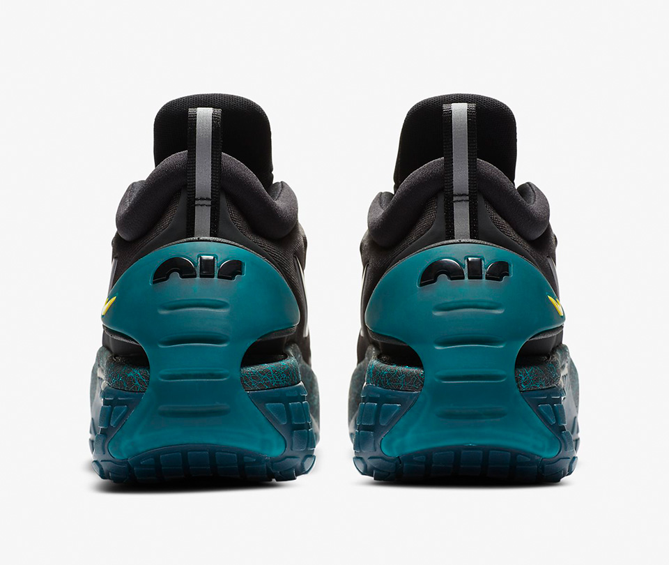
Nike Air Zoom Alphafly NEXT% shot by Swanson Studio, Art Direction by Adriano Furtado/Nike Global Running
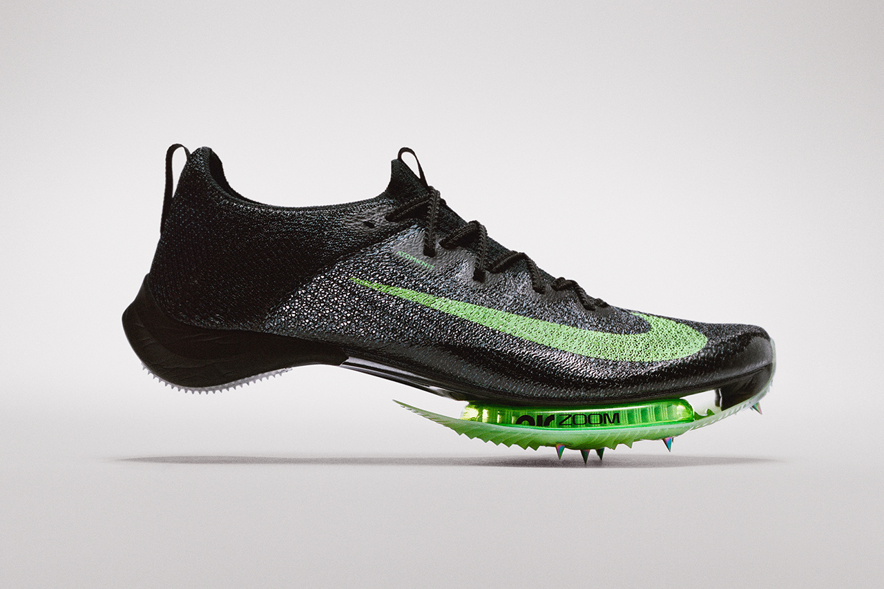 NIke Air Zoom Viperfly shot by Swanson Studio, Art Direction by Taro Motoda
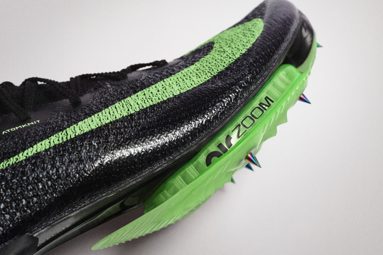
The Air Zoom lockup was introduced on the 2020 Olympic footwear lineup, announced February 2020
Why rebrand Nike Air?
Nike Air is one of the most loved footwear innovations of all time, but the public perception was not aligned with Nike’s vision; Nike Air is rooted in performance. The opportunity to re-position Nike Air as a performance innovation aligned with the release of Nike’s most exciting line of Air performance innovation shoes launched to date, including the Nike Air Zoom Alphafly Next%—the shoe Kipchoge was wearing when he broke the two-hour marathon barrier.
OUR WORK
The redesign is an attempt to realign Nike Air as a performance innovation, drawing consumer expectations closer to the company’s vision of the Air innovation platform. We created a simple system and brand strategy to be utilized by product and marketing teams to create an intuitive and integrated ecosystem.
The redesign is an attempt to realign Nike Air as a performance innovation, drawing consumer expectations closer to the company’s vision of the Air innovation platform. We created a simple system and brand strategy to be utilized by product and marketing teams to create an intuitive and integrated ecosystem.
OUR FOCUS
Nike Air is currently split into three distinct innovations: Air Max, Air Zoom, and Air Vapormax. To tell the unique story and benefits of each innovation, we worked to build a meaningful vocabulary through consistency on product, logo, packaging and communication. The fundamental role of the new brand system is to build platform equity and lead the consumer on a self-guided journey to understanding the unique benefits the Air platform has to offer.
Nike Air is currently split into three distinct innovations: Air Max, Air Zoom, and Air Vapormax. To tell the unique story and benefits of each innovation, we worked to build a meaningful vocabulary through consistency on product, logo, packaging and communication. The fundamental role of the new brand system is to build platform equity and lead the consumer on a self-guided journey to understanding the unique benefits the Air platform has to offer.
MY ROLE
When I joined the project, the team had a brief and general strategy, but no design. Working as part of a small team of three, I led exploration on all things visual. As the project grew, we presented to and collaborated with multiple product and brand functions across the company. I was also responsible for engaging and leading agency relationships as we worked to expand and systematize the work and guidelines.
When I joined the project, the team had a brief and general strategy, but no design. Working as part of a small team of three, I led exploration on all things visual. As the project grew, we presented to and collaborated with multiple product and brand functions across the company. I was also responsible for engaging and leading agency relationships as we worked to expand and systematize the work and guidelines.
ONE MORE LOGO
Nike loves logos. At one point, almost every new Air Max shoe had a new logo to match its distinctive style. When this project started, there were at least 20+ different Air logos being used on product.
The logos for the three unique Air innovations had been developed independently of one another without consideration of the innovations’ roles within the broader Nike Air platform. Although this created a rich and diverse visual language across the product, it prevented the consumer from understanding the relationship of the individual innovations to Nike Air.
Inconsistency in naming and branding across Air products stood in the way of building a system that was easy to navigate. Additionally, when Nike introduced ZoomX foam in 2016, the existing Air Zoom logo had been appropriated in branding ZoomX. The two innovations had nothing in common, but shared a logo.
Instead of continuing along the path of independent branding for each innovation, we opted to create just one more logo and worked to bring consistency to the platform by creating a simple and straightforward brand system specific to the Nike Air platform around that mark.
BEFORE
![]()
AFTER
![]()
DID YOU KNOW?Generally, Air Max units provide comfort while Air Zoom units produce spring and speed. I had no idea that there were performance differences between Air, Max, Zoom, and Vapormax units when we started this project.
DID YOU KNOW?Generally, Air Max units provide comfort while Air Zoom units produce spring and speed. I had no idea that there were performance differences between Air, Max, Zoom, and Vapormax units when we started this project.
The Logo
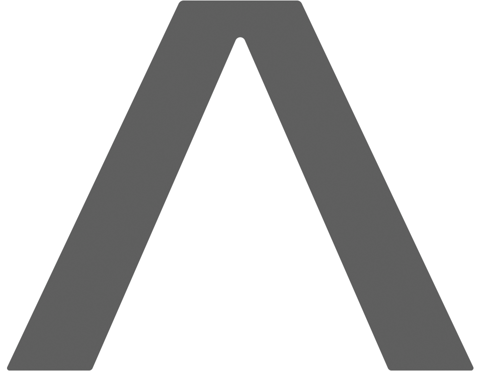
THE IDEA
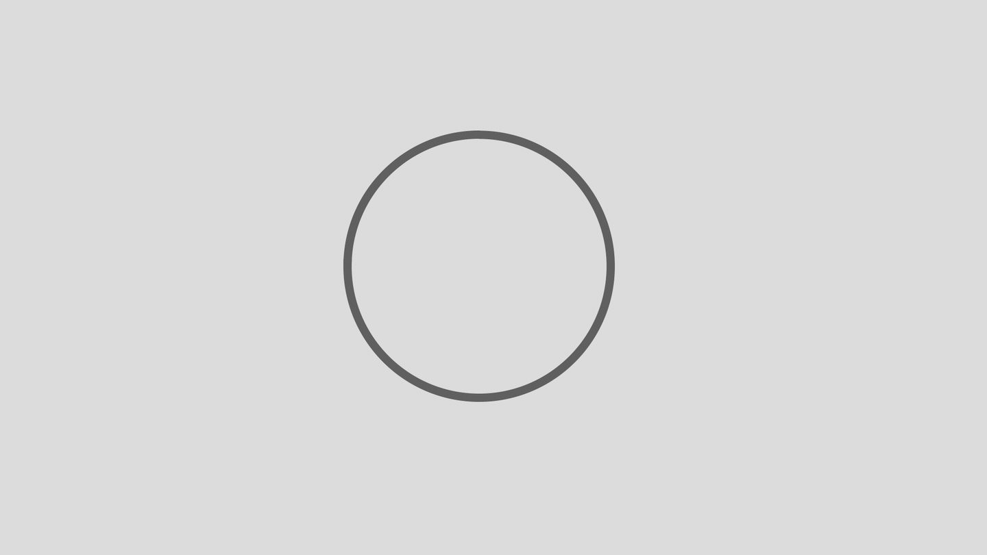
At its core, the Air logo is based on the simple and pure geometry of a circle. The circle can represent the concept of an air molecule, a bubble, or even a simplified air bag.
From that, the building blocks of the letter forms spelling “Air” can be pulled: a half circle, a straightened quarter circle, and a quarter circle.
Those paths are then distributed using the diameter of the original circle and the stroke is thickened—or inflated, much like an air bag—to create a bold mark with a strong hierarchical read.
REFINEMENT & ADJUSTMENT
The structure of the original Air logo concept has been applied to a grid for furthered refinement. The height of the “I” is adjusted for optical alignment. Rounded corners are added to give the mark a familiar softness while maintaining the integrity of the mark. The corner radius, based off the grid size, informs adjusted spacing between each letterform.
To ensure optical rendering at any scale, we have three versions with different corner radii. The primary logo features tight rounded corners and letter spacing (2x grid). As the logo is edited down for smaller scales, the logo has more pronounced curves and more open letter spacing (4x grid).
I’m not sure about you, but I’m normally one to laugh at logos on grids with circles and lines everywhere hinting to a conceptual geometry that doesn’t actually exist. In the case for this logo, there is some reason here, despite it also being just some geometry that’s a product of an organic exploratory process. Regardless, knowing the process soothes my anxious tendencies, but feel free to still have a laugh on my behalf if you must.
Typography
AIR INNOVATION TYPE
An innovation as unique as Nike Air requires a distinct typeface. A bespoke typeface was created in tandem with the new logo. The intent was to pair this new type with the new logo to create the individual innovation lockups.
Nemanja Jehlicka, teammate and typophile, joined our small team in the middle of the project and immediately dived into taking the lead in concept and design for the typeface. Nemanja worked with Marko Hrastovec, of Hot Fonts Foundry, for additional development, refinement, and finishing of the files.
The final design lands in an innovative and futuristic space. Exaggerated straight lines contrast the curves of the Air logo, giving the type a machined precision, while the tight but rounded corners draw the two together.


 Typeface designed by Nemanja Jehlicka, in collaboration with Marko Hrastovec of Hot Fonts
SIZE MATTERS
On-product application requires logos to work at a small-scale and withstand a variety of application processes: print, emboss, deboss, heat-transfer, etc.
To ensure optical rendering for smaller sizes, the innovation wordmarks are scaled up to match the full height of the Air logo.
On-product application requires logos to work at a small-scale and withstand a variety of application processes: print, emboss, deboss, heat-transfer, etc.
To ensure optical rendering for smaller sizes, the innovation wordmarks are scaled up to match the full height of the Air logo.
Can it float?
LOGO ANIMATIONS
Nike Air has always been a little irreverent and playful. We tried to bring some of that enegry into the branding with animations of the logo.
Working with More and More, we used the logo to convey various product benefits that Nike Air provides: from the lightweight and plush comfort of Air Max to the propulsive speed of Air Zoom.
Animations in collaboration with More and More
Category Integration
INTO THE WILD
The logo and lockups are slowly making their way into the world as more products are branded with the marks, giving the design teams a chance to use the logos in product marketing campaigns, resulting in a tighter cohesion between product and marketing creative.
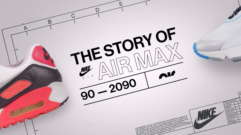 Title card for The Story of Air Max on YouTube
3D animation by Dean Giffin, as part of Nike Running’s Tempo Next% Behind the Design
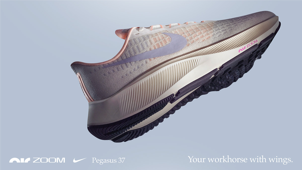
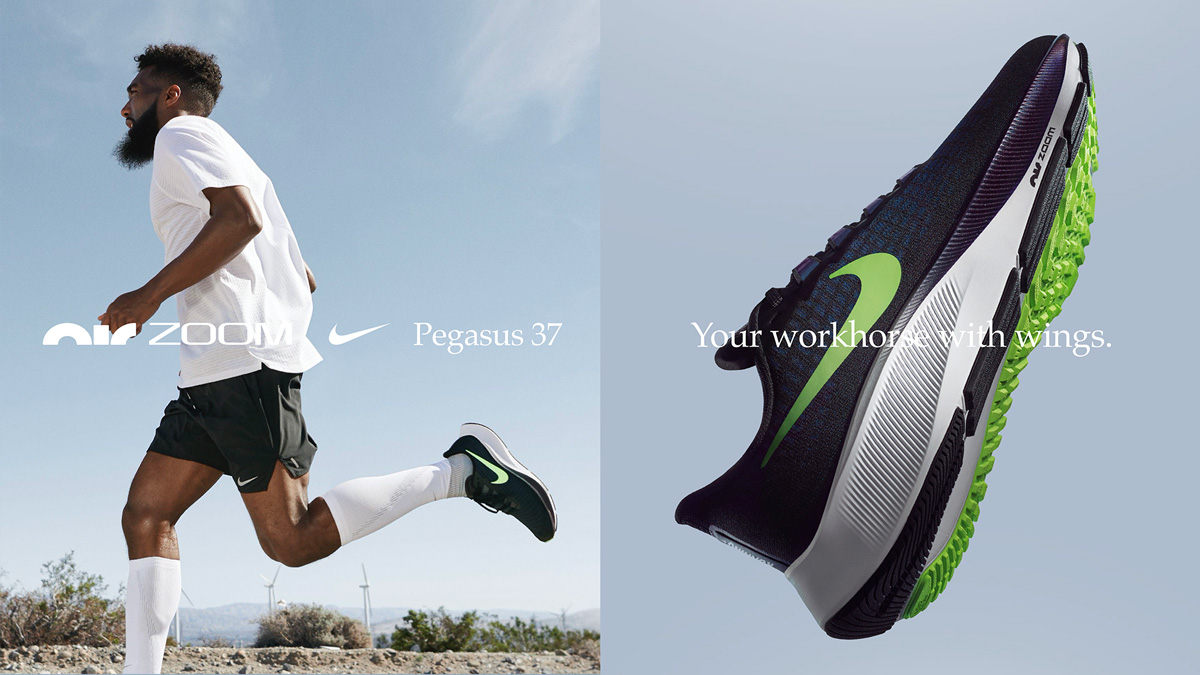
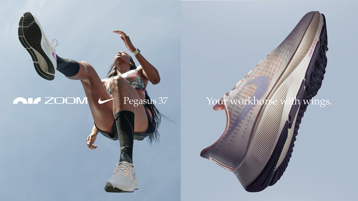
Nike Running’s Air Zoom Pegasus 37 Behind the Design
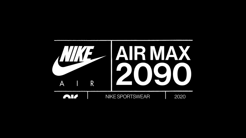 Lockup from the Air Max 2090 creative from Nike Sportswear
© 2021 BM